In the next release of ApexSQL Monitor 2015, version R3 planned for late May, we will improve the presentation of some charts by using a logarithmic scales for the y-axis.
Using a logarithmic scale allows a large data range to be displayed without small values being compressed down towards the lower end of the chart, which is the case when one or a few values are much larger (or smaller) than the bulk of the data.
The following charts will utilize the logarithmic scale starting with the R3 version: Average bytes per write, Free space, Average bytes per read, Available megabytes of memory, Page life expectancy, Buffer cache hit ratio.
Here is an example of the Average disk bytes per read chart where a linear y-axis scale is used:
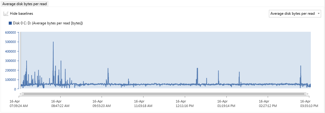
As it is visible in the image above, the most important part of the chart where medium and high threshold zone resides is almost impossible to distinguish as this zone generally occupies very low value y-axis area. Even enlarging the view several times is not of much help as values of the both medium and high baseline threshold is below 10,000, which is a very small area on the graph where highest value riches over 500,000.

So why is the lower range of the data points more important than higher range? Because the high range of data points represents the safe zone from the performance stand of view. The higher the value the better performance experienced. But the moment the metric value falls below the safe zone limit, which is defined by the medium and high thresholds, indicates the start of performance issues. But in the linear scale chart, distribution of small plot points are compressed in the lower part of the chart close to the X-axis, making them indistinguishable from each other visually.
And here is the a chart, using the same data where a logarithmic scale is used for the y-axis:

With the logarithmic scale, the most important area, where the statistical baseline’s standard deviation ranges showing medium and high thresholds, is rendered with much more granularity. The higher values (the safe zone) is compressed in the small area of the upper part of the chart allowing attention to be focused on the problem areas.
As demonstrated, a logarithmic scale ensures the best visualization of the key data, by emphasizing the most actionable measurements by improving granularity and visual acuity.
April 28, 2015