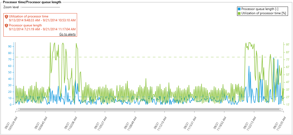
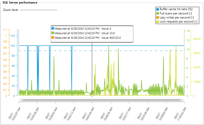
Chart lines can be turned on or off
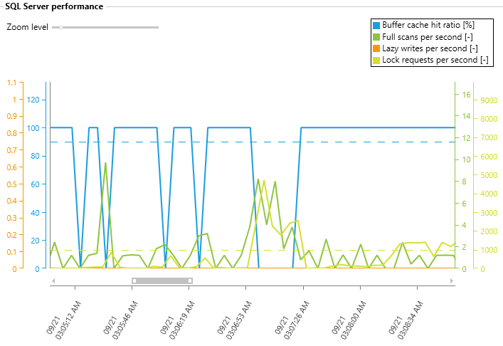
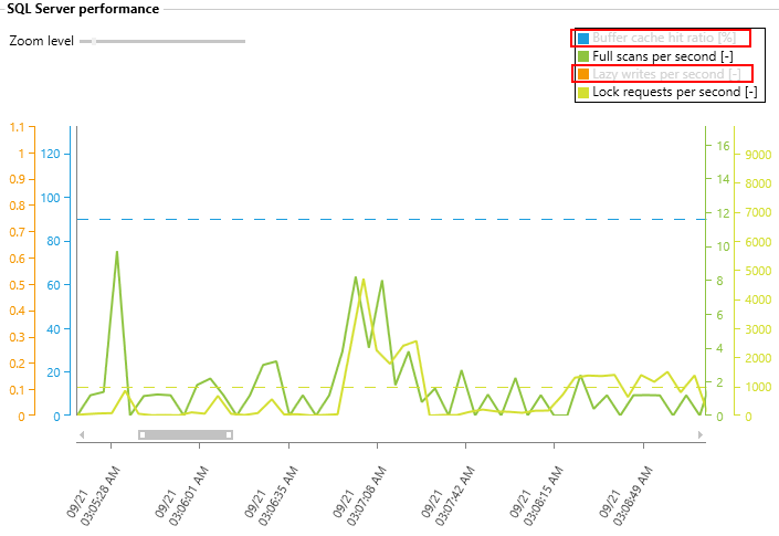
To provide better graph legibility, we’ve added the ability to customize measurements. This can significantly improve legibility with more than one measurements and/or with high frequency. Turning the chart measurement on/off can be accomplished by a simple click on the measurement name
Custom chart colors
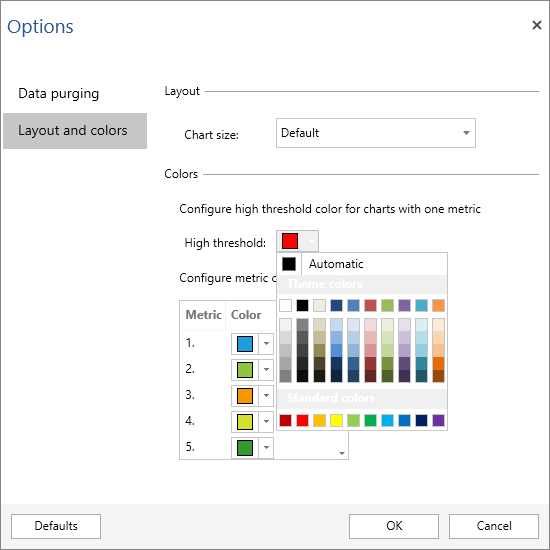
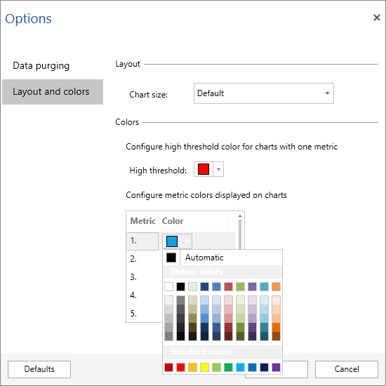
Chart color customization was in response to feedback we got from people who either didn’t like default colors and/or had trouble distinguishing them
Individual devices monitoring
ApexSQL Monitor 2014 R2 now collects and displays the data for individual devices such as disk or network card and the unneeded device can be now excluded from monitoring. Now separate metrics for each disk and network device can be monitored
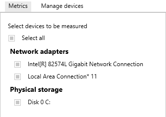
Having a separate monitoring and data collecting for devices, ensures faster and more precise analysis of potential issues
Validation of the user changed parameters
The explicit application validation logic we have introduced will prevent the input data that is in collision with previously existing data, preventing any unpredictable alerts. The image below shows an example where the changed Threshold high value overlaps with Threshold low and Threshold medium values and therefore application marks this in red and prevents this change to be applied
Database and SQL Server state and availability monitoring
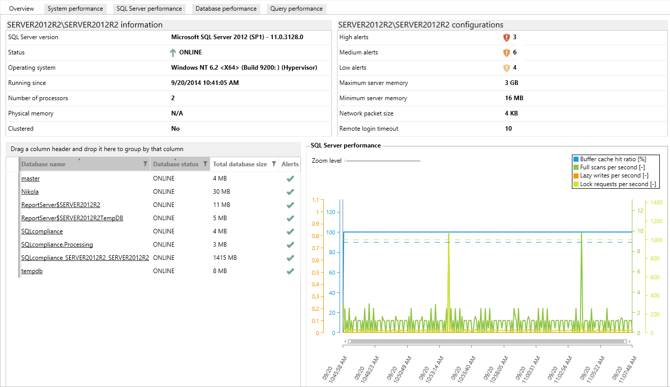
The Overview tab now includes SQL Server and Operating System information, state and information for the monitored databases, and a graph with the most important performance metrics
Usability improvements
- SQL server instances can now be disabled or enabled for monitoring
- An individual database can now be excluded from monitoring
-
Chart displays a last 30 minute time range of measured values instead of the full day, making charts easier to read and analyze, as these are not overcrowded anymore, while improving the chart loading performance at the same time
- Data purging settings have been moved to the new Options dialog which consolidates this setting into a single place, instead of having to navigate to every individual SQL Server instance to set this option
-
Trackball (see below) consolidates all measurements, instead of having a separate one for each
- The metric time period in graphs is now in seconds instead of milliseconds
September 24, 2014


