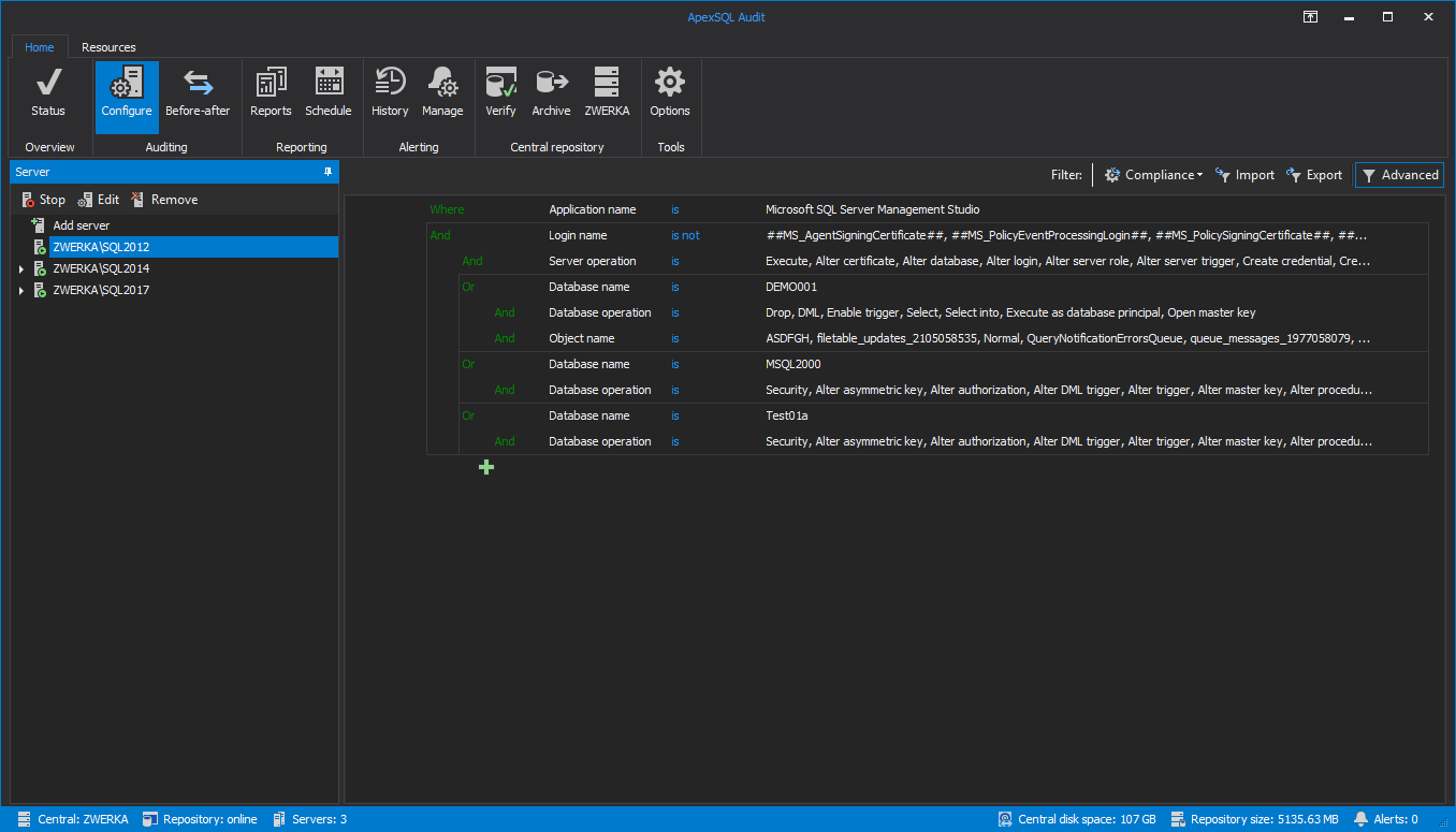
ApexSQL Audit is an enterprise level product with a ton of features. Although this is good, users can sometimes fail to see the proverbial forest for the trees, in navigating the user experience. One key impediment has been the implementation of panels on the interface, without segmentation.
This is a summary of panels (SDI) vs forms (MDI) research and proposals of a new design for configure auditing in ApexSQL Audit.
It is safe to assume that if faced with a plethora of controls on a single form, a typical user will be confused and disoriented. Sometimes, no amount of grouping, sizing, or spacing can help you when you have many important controls. A Wizard form is the best thing for such scenarios. Dividing controls by task or categories, and placing them in separate steps can help the user stay focused and not be daunted by the task.
However, before using wizards to step users through a complex operation, consider if the operation can be fundamentally simplified so a wizard is unnecessary. As helpful as wizards are, they are not appropriate for all situations. They can require a higher interaction cost than other input patterns or may block access to other parts of the app that is necessary for completing the process. The main advantage of single page type of interface is that it is simple to use and a complicated task can be performed in an easy manner without switching from one wizard form to the other.
Microsoft Windows UX Guidelines
From the UX checklist for desktop applications we can get lots of helpful information and guidance
“Consider lightweight alternatives first, such as dialog boxes, task panes, or single pages. Wizards are a heavy UI, best used for multi-step, infrequently performed task. You don’t have to use wizards—you can provide helpful information and assistance in any UI.”
Wizards usage
- Use when the user needs to perform a task or a goal that dictates more than one step
- Use when the user needs to perform a complex task consisting of several dependable sub-tasks
- Use when the user needs to input complex data into a system but the tasks are more easily achieved by splitting the process into a series of smaller and simpler steps
- Use when the user needs guidance: the user wants to achieve an overall goal, but may not be familiar with the steps needed to reach the goal
- Use when the steps needed to reach a final goal may vary due to decisions made in previous stages and have to be completed in a specific sequence
Panels usage
- Use for presenting a comprehensive list of what information a user must provide so he/she can gather whatever information they lack before starting a task
- Use when the task itself isn’t complex
- Use when user doesn’t need steps that take an isolated UI space
- Use for presenting the concept and displaying lots of related details that have already been collected
- Use for making it easy for users to navigate among data-entry fields by pressing Tab which can be a significant consideration if users fill in a given form many times during the day
Criteria for Choosing the Right Approach
- How definitive can we make the menu choices?
If we need to lead users through a series of qualifying questions before they can know what final action they should take, a wizard might be the more appropriate choice. - The amount of data users must provide
If there is a lot of information for the user to provide, wizards would be a good choice because they split a complex process into multiple steps. So wizard pages are simpler — they contain fewer fields and overall less information. - The frequency with which users would use a wizard or panel
For repetitive tasks, users may quickly get tired of the interactions and performance hits that wizards bring with them.
Usability review results and conclusions
After the research, we can assume that the new design for configuring Auditing in ApexSQL Audit should include Tabs instead of Wizards mainly because of the fact that user doesn’t have to be guided through multiple required steps and complete them in a specific order.
Choosing the events audited by ApexSQL Audit, as well as specific applications and SQL server logins or configuring object filters for each database can be derived into 3 steps, a minimum number of steps in designing a wizard, and make the design more organized in that way.
But since the task of configuring auditing filters is not too extensive, the new design can be simplified to a point where a user can select an arbitrary tab, make changes, and then commit them without looking at the other tabs or, if needed, make a change in all tabs before committing instead of going through wizard couple of times.
In addition, the Microsoft UI checklist that we cover now through our updated standard suggests considering other alternatives before deciding to go with the wizard.
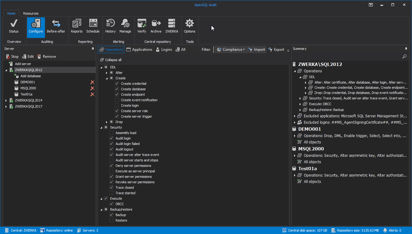
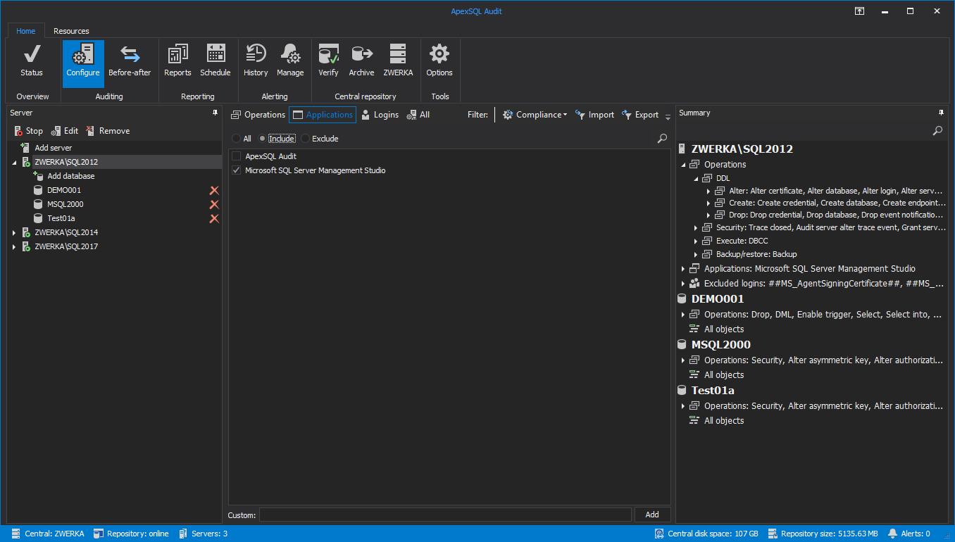
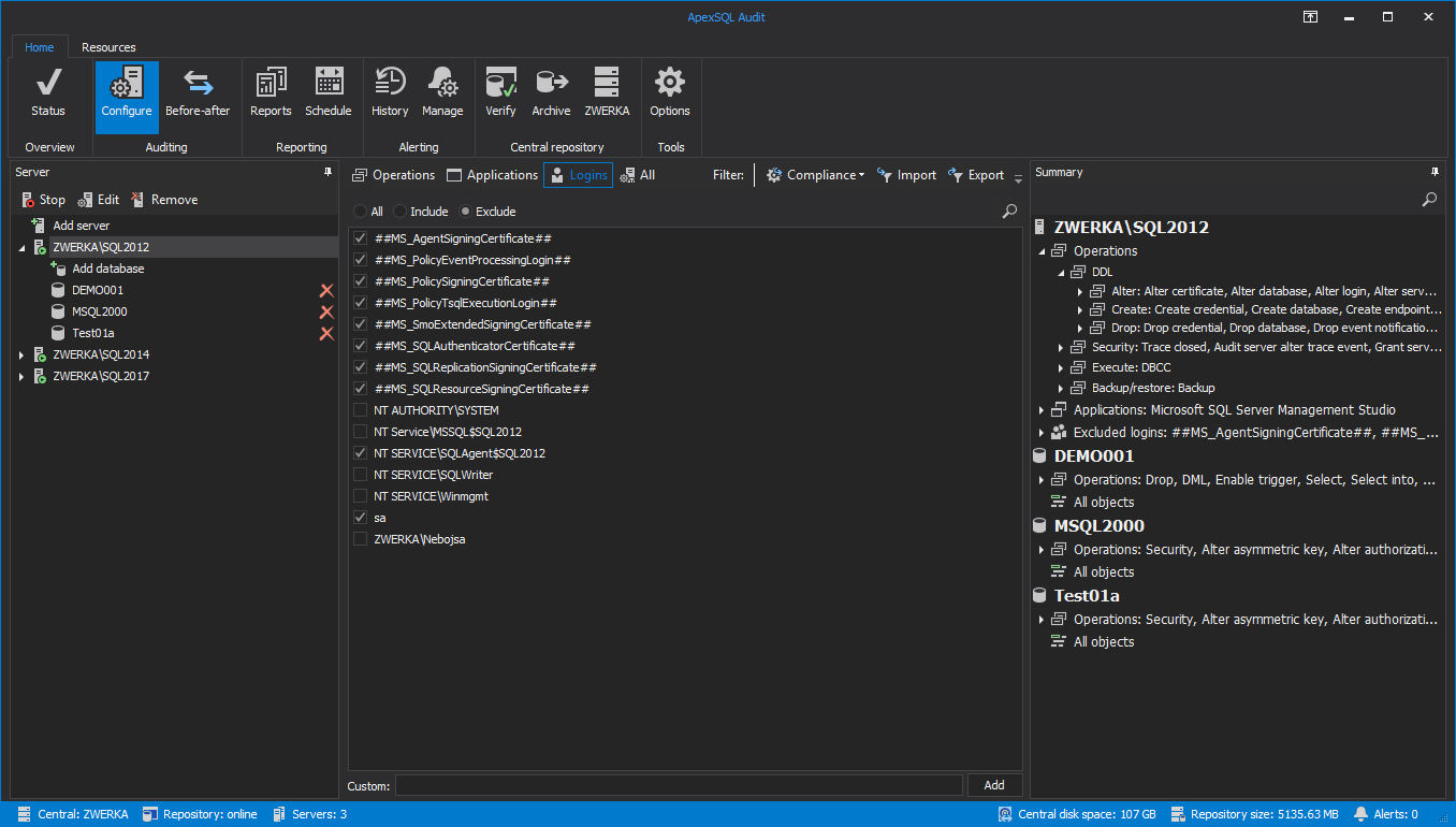
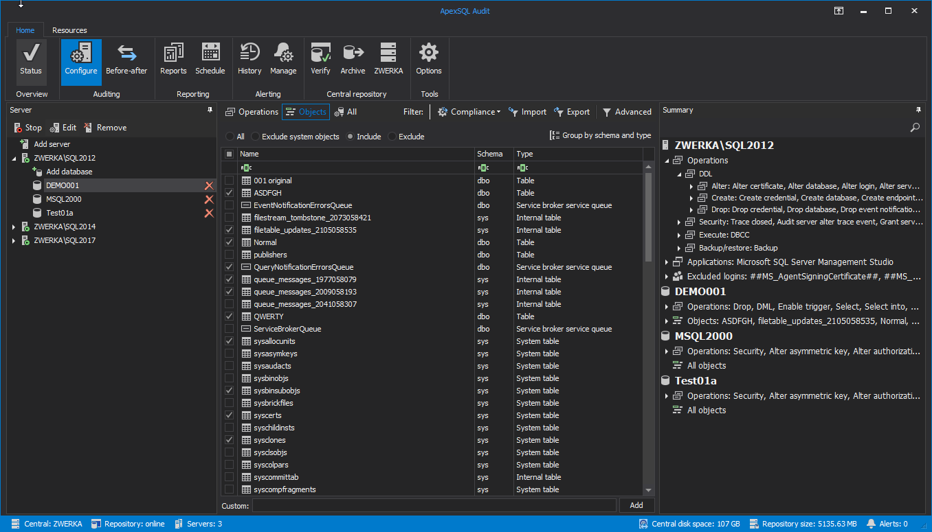
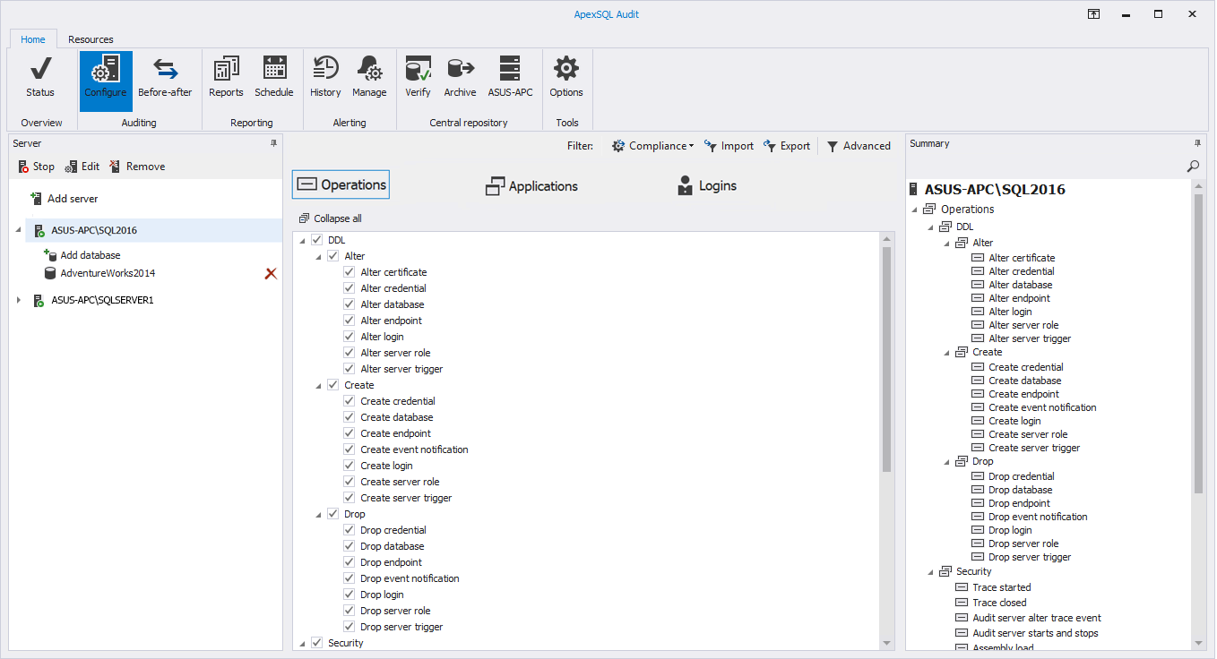
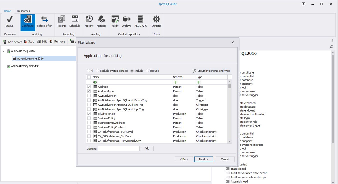
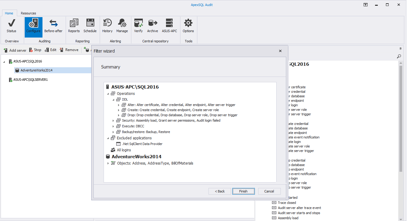
Nevertheless, our team is proposing three solutions for a new Configure auditing design, one through Wizard and the other two with Tabs (regular tabs and tabs with toggle buttons).
Included below are various screenshots of mentioned proposals.
We hope to implement these changes in the next, upcoming release of ApexSQL Audit. If you have comments, suggestions, requests, issues etc, we’d love to hear from you. Please email us at support@apexsql.com or use comments section below
Tabs
Toggle buttons vs tabs
Wizard
February 5, 2018


