In the next release of ApexSQL Monitor 2015, version R3 planned for late May, we will significantly improve the presentation, performance, and functionality of our SQL Server performance base lining feature
What is new – We have visually conveyed the calculated baseline’s 1st and 2nd standard deviations that represent the medium and high statistical thresholds respectively of the particular performance measurement
Here are a few examples of the charts where baseline’s 1st and 2nd standard deviations areas are displayed:
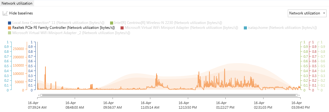
Chart with multiple metrics
In case of charts with multiple metrics displayed, the Show baseline button will automatically enable a single metric display mode for standard deviation areas. The desired metric can be easily selected by clicking on its name in the metric legend above the graph
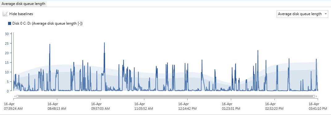
Chart with single metric
An example of single metric chart with standard deviations area that represents the medium and high statistical thresholds
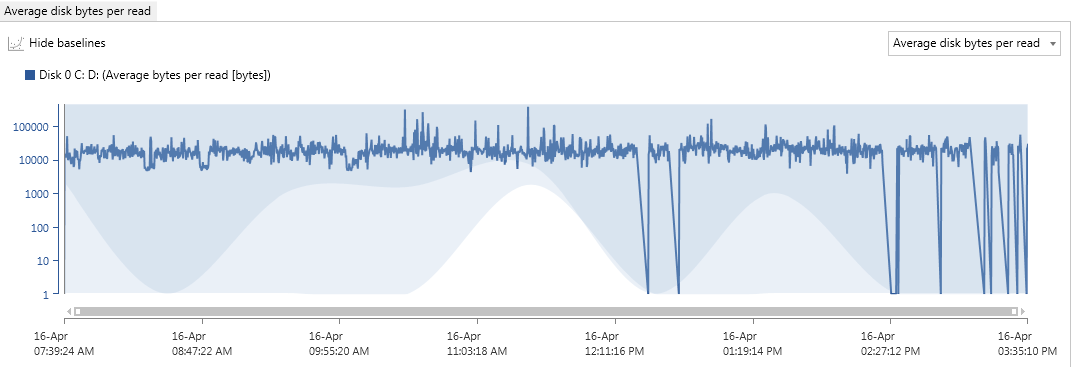
Chart where lower bounds determine metric thresholds (higher is better)
April 17, 2015


