We are proud to announce a brand-new look of the ApexSQL Monitor dashboard that will be part of the upcoming release, in September.
Panel view
This panel view allows users to easily find most problematic instances of SQL Server and to quickly check the state of monitored SQL Servers.
The panels themselves are two-sided with details including SQL Server name, type, version, availability status and parent group.
Also, in the top-right corner you can find a button for “flipping” the panel and an ellipse that will open context menu for managing the instance (e.g. remove, disabled monitoring and manage credentials)
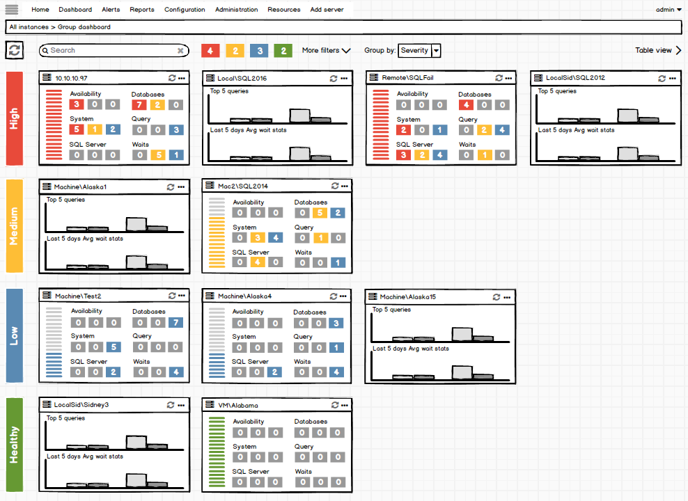
Panel topography:
- Server icon which represents: server type and current status
- Server name and hovering over it will open tooltip with information about parent group and server version
- Button for flipping panel
- Button for opening manage the instance context menu
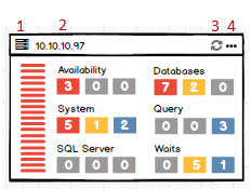
The front side of panel shows state of SQL Server instance, including a battery indicator (#1) and alert counts by category (#2)
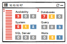
The back side of the panel shows the Top 5 highest queries (#1) and Average wait stats for last 5 days (#2).
Table view
Beside adding panel view we have updated table view and added several enhancements.
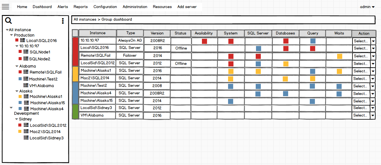
On this image, you can find the old design of the table view
In new design of table view we have added new additional “Group” column to the table in order to show additional info the custom group of instances.
We changed instance state representation and now we have square, for each alert category, with total number of alerts per instance instead of just square showing the severity of the highest alert for that category.
Also, in the metric type alert columns, from single square alert representation we moved to showing number of each alert type for metric.
For example:
– 10.10.10.97 AlwaysOn Availability group has 5 high, 1 medium and 2 low alerts for System metric type as you can see on the next image
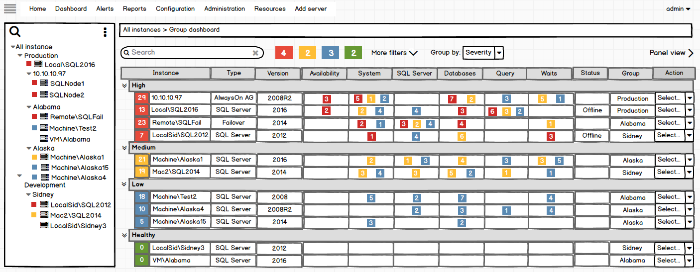
We have amended the server status icon to include a count of the total number of alerts for that instance.
Filters
The new design will also include new filters that are applied to table and panel views
- Search instance – Allows searching to show only instances which names are matching entered characters
- Group by – a user can choose between grouping by Severity or Custom groups that were previously created
- Filter – 4 colored buttons where each represents number of instances with appropriate state
- Critical state – High alerts
- Warning state – no alert higher than Medium
- Alerted state – Low alerts only
- Healthy/Normal – No alerts
These controls can be toggled to show or hide instances of that status. For example, if the control for Healthy/Normal servers is toggled off, servers of this state will be hidden and only instances with active alerts will be shown
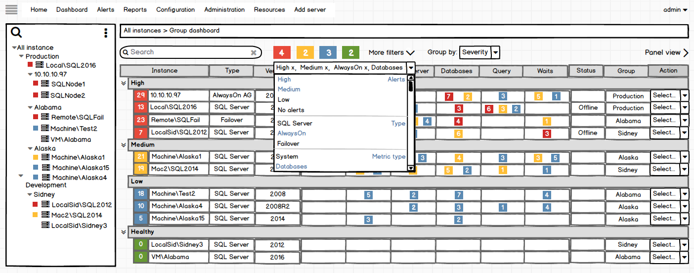
- More filters – This offers multiple options for filtering as you can see on the next image
For example:
- Alerts: high and medium
- Server type: AlwaysOn
- Metric type: Databases
In this case, you will only see instances which server type is AlwaysOn and which there are high and medium alerts for the metric category “Databases”
July 25, 2017